You submitted the reading version of your PhD thesis – Congratulations! But now comes another big step. You will need to prepare your thesis for printing, and Dutch universities have very specific requirements. Your PhD thesis needs a beautiful cover and a neat layout. You need to think about the design of your invitation and propositions page. Finally, printing companies have a whole laundry list of conditions your document needs to fulfil. And some of them can be hard to understand. (Color space, anyone? Crop and bleed – what?) But don’t worry, I’ll explain everything you need to know!
The four big documents
There are four documents that you will need to provide for printing a Dutch university PhD thesis: The book cover, the invitation to your defence, the propositions sheet and the layout of the thesis body. The last one is of course the most important part, the thing that you have worked for all these years!
The cover
The cover of your thesis serves two purposes. Firstly, it informs the reader about what she will find inside. Secondly, it should catch potential readers’ eyes. The first part is easy – all you need to do is add your name and the title of your thesis to the cover when you prepare your thesis for printing. However, the second part can be a bit tricky. A good way to catch attention is to tell a story on your cover, captured in just one image. The content of this story is, of course, your thesis. But more on that later!
The invitation
Let’s move on to the third of the four big documents: The invitation to your defence. This is usually a piece of thick paper in the format of a slender bookmark. To give your book that well-rounded look, the invitation should tie in with the design of the cover. That is, it should be in the same main color and/or pick up elements of the cover’s design, and be set in the same font as the title.
The propositions
Then, there is also the propositions sheet. This is a loose piece of paper, slightly smaller than your thesis (usually DIN A5), which is put into the book for everyone who attends your defence. While you should avoid overly elaborate designs, you can put a faint reproduction of your cover on the propositions sheet. It looks especially sleek if you just pick one central element of your cover and put it in the background. After all, the design should not distract from the propositions themselves.
The layout
The layout of your thesis is the document that you will probably spend the most time on to get it into tip-top shape for printing. After all, your PhD thesis will be a published book, accessible to everyone. It will serve people in your field as a reference for many years to come. Hence, it is of the utmost importance that the layout of your thesis is clean and well-arranged. I will explain how you can achieve an impeccable look for your thesis a bit later in this article.
Now you know which documents you need when you prepare your Dutch university PhD thesis for printing. So, on to the specifics!
Feeling overwhelmed? Don’t worry, contact me for help with whipping your thesis into shape for printing!
Printing a Dutch university PhD thesis: The cover
The cover of your PhD thesis is like an advertisement for its contents: It should be informative but also visually pleasing. That’s a lot to ask from one single image! Hence, I will try to break the process down for you.
First of all, you might want to try to summarize what your thesis is about in one sentence. Try not to make that sentence insanely long to sneak as much info in there as possible. Make it a concise sentence that even your mom will understand (If your mom knows science, pick a different relative. Someone with a regular job.)
Now, this next step might seem a bit esoteric but I recommend you try it: Close your eyes and focus on your sentence. Which images come to mind? Maybe it’s just shapes or colors. Maybe it’s a certain diagram or a scene of yourself doing field work. Use this as a starting point to draft your cover, maybe just by drawing the shapes and colors you envisioned.
Now, take that sentence again. Is there a key figure, a diagram, a micrograph, an equation that is at the heart of your thesis? Maybe you’d like to use a stylized version of this on your cover. Did you use a certain technique all the time? You could represent part of it on your cover. Or maybe the landscpe of the area where you did your field work left a lasting impression on you. Whatever concrete image you think embodies your thesis, you can use a (stylized) version of it on your cover.
If you are doing your PhD thesis in the Netherlands but came from another country, you might want to reflect your culture on your cover. You could, for example, use a typical art style from your home country, or a pattern often found in your culture.
For inspiration, check out these examples of PhD thesis covers:

Once you have a rough idea of what you want to include in your PhD thesis cover, make a very simple sketch using pen and paper or your favourite digital painting program. Once you are satisfied (for the time being), it’s time to decide on the actual colors you would like to use. A monochromatic cover – that is, using different shades of the same color – can look just as stunning as a cover with contrasting colors. If you want to try out color palettes, I recommend the free Adobe Color Wheel.
The right color space to print your PhD thesis in
There is one thing that people always find confusing when preparing a PhD thesis for printing: color spaces. You might have heard the acronyms CMYK and RGB. CMYK stands for Cyan, Magenta, Yellow and Black. These are the exact colors of those expensive cartridges in your printer. Hence, the CMYK color space is used for printing. On the screen, however, colors are in the RGB color space, which stands for Red, Green, and Blue.
The only thing you need to know right now is to set your painting software to CMYK and make sure that you only use CMYK colors in your image. When you export the file to PDF, choose the option to set the colors to CMYK.
But why all that hassle? Simple: If you design your image in RGB, the printed result can look very different from what you saw on the screen. Just check out this image that I stole from Wikipedia:
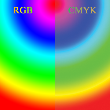
Hence, if you want to be fairly sure about how your cover looks when it’s printed, use CMYK. All that being said, you can still use RGB, just know that the printed version will look different (mostly somewhat subdued).
Finally, you can get to work on your actual PhD thesis cover. If you want to do it in a style that looks hand-drawn, you can use painting software such as Photoshop or Corel Painter. Krita is a great free painting program but unfortunately, it doesn’t offer CMYK.
If you want to go for a very tidy image, vector illustration software might be what you need. The industry standard is Illustrator, but Corel Draw can do pretty much the same while costing only a fraction and you can download and own it instead of being chained to a subscription for life. And there is the very powerful free, open source program Inkscape. However, once again, it doesn’t offer CMYK (crying emoji!).
Or you could grab high-quality paper and oil pastels/ colored pencils/ aquarel colors/ crayons and, like, actually draw your cover. Be sure to draw it at least as big as the finished cover (17 x 24 cm for only the front cover and about 36 x 24 cm for front and back cover). Also, set your scanning software to CMYK and at least 300 dpi.
For a more detailed explanation of CMYK and RGB color spaces, click here. And this article will teach you about proper image resolution.
What you need to know about resolution, crop, and bleed for printing your thesis cover
No matter if you go digital or old school, make sure that your PDF ends up at the right size, including bleed and crop, and is at least 300 dpi.
What are bleed and crop, you ask? Basically, the printing company will cut your cover to size after printing it. And they can’t guarantee that this cut will be precisely on the edge that you envisioned for your cover. Hence, all colors and elements that run to the very edge of the page should be designed to go 3 mm further than the actual edge. This is called bleed.
Also, the printing company might cut a millimeter or two too far into your design, so make sure that text and other elements end at least 3 mm away from the edge of the cover. This is the crop. Ideally, you should include crop marks and make sure that they are 3 mm away from the edge of the page.
Voila, your thesis cover is ready for printing!
Too much to pay attention to? Not the creative type? Contact me for your PhD thesis cover!
Printing a Dutch university PhD thesis: The layout
First, let me explain the word “layout”. It means nothing more than to arrange elements on a page. In your case, those elements will be mainly text and figures. There will probably also be a few tables, maybe even some mathematical equations. Unfortunately, you don’t have much choice when it comes to the size of your layout: A Dutch PhD thesis is 24 by 17 cm in size. Now, how do you make the most of these 408 cm2?
There are a few basic decisions you need to make: Which font do you want to use? What size should the font have? Do you want to have a header on each page? And what should the chapter start pages look like?
Fonts: The good, the bad and the ugly
You might think that choosing a font when preparing your PhD thesis layout for printing is hard. Well, not really. There are a handful of fonts that look great in any context and are always safe to use.
But let me explain a little first: There are two general types of fonts: Serif and sans-serif. Serif fonts are those with the tiny lines added to all the ends of each letter, like so:
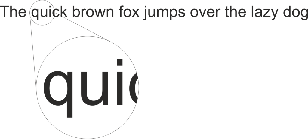
As opposed to a sans serif font that doesn’t have those little lines:
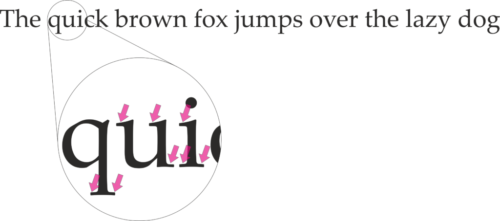
I strongly recommend you use a serif font for the main text of your thesis. Why? Because those little lines, the serifs, act as a guideline for the reader’s eye. They make sure that her eyes don’t easily jump between lines while reading printed text. Hence, your reader’s brain won’t get tired too quickly. So, by choosing a serif font for your PhD thesis layout, you are making sure that your opponents will read as much of it as possible. However, you are perfectly free to choose a sans serif font for your thesis title and all headings.
The font for your main text needs to fulfill a few conditions: It has to offer all four styles: regular, bold, italics and bold italics (yes, those are four distinctly designed styles). If you use greek letters, trademark™ or registered trademark® symbols anywhere in your thesis (usually they come up in Materials & Methods), make sure your chosen font offers those, too. Also, you will definitely have to display French, German, Polish, Spanish, Swedish, etc. names in your bibliography. So, you also need to make sure that the font has all those umlauts, strike-through letters, accented letters, etc.
Definitely use a font that was actually made for displaying text in the Latin alphabet (the alphabet you are seeing in this very text right here). I very much advise against using fonts that were made for languages that use a different alphabet (Cyrillic, Hanzi, Kanji, etc.). While those fonts often contain Latin characters, they have a few shortcomings that can make your layout look uneven and clunky.
In this article I highlight a few timeless fonts that offer all characters you can dream of when doing your PhD thesis layout. I also explain everything you ever wanted to know about fonts!
And, last but not least, don’t use Comic Sans. For anything. Ever.
Headers: Signposts for your reader
A header – not to be confused with headings, the titles of your sections, subsections, etc. – is the space between the top of your main text and the upper edge of the page. If you use a header in your thesis layout is entirely up to you. I do recommend using one though because they can convey useful information to your reader.
Mostly, you will see the chapter number in the header of the left-hand page and the (shortened) chapter title in the header of the right-hand page, as in this example of a PhD thesis layout:

In the above example, you can also see that the header is separated from the main text with a line. This helps to make sure that the reader’s eyes don’t latch on to the header each time they turn the page.
The counterpart of the header is the footer: the space between the bottom of your main text and the lower edge of the page. It usually contains only the page number. You can choose whether the page number should be in the center of the footer or at its outer edge. For reasons of visibility, I recommend the outer edge.
For more tips regarding headers and footers in your PhD thesis, check out this page.
Printing a Dutch university PhD thesis: Chapter start pages
When your are writing your PhD thesis at a Dutch university, you will propably have seen a few printed thesis books. There, you might have noticed the chapter start pages. They usually show (some part of) the cover design, either in black and white or in fainter colors.
You can get even more creative by putting one element of your thesis cover that represents the current chapter onto the chapter start page. For this, of course, your cover needs to contain such elements in the first place. Here is an article where I go into more detail about chapter start pages.
Too much other stuff to worry about to polish your layout to perfection? Contact me for help!
Alright, that’s it for the ultimate guide to preparing your PhD thesis from a Dutch university for printing! Make sure you check out these in-depth guides on the specific topics: