Headers and footers in your PhD thesis can be a valuable guide for your readers – but only if you use them right! In this article, I will tell you what to do and what not to do. I will also cover the thumb index, meaning the chapter number at the edge of the page.
What are headers and footers?
If you read the Ultimate guide to designing a Dutch university PhD thesis, you already know a little bit about headers and footers. Here, I will go into more detail about them.
Each text page in your PhD thesis will have a block of text in the middle. This is the main area of the page. Everything above that is the header. Everything below it is the footer.
The only thing that is mandatory to have is the page number, for obvious reasons. The page number in PhD theses is usually displayed in the footer. In theory, you could leave the header entirely blank. But then you would pass up a chance to improve the reading experience!
The header of a PhD thesis can convey valuable information
In order to healp your reader orient herself, you can put useful information in the header. Some examples of this are the chapter number, the chapter title, or the section title. That way, your reader (i.e. your opponent) will always know which part of your thesis they are reading. What is more, they will be able to jump to that chapter quickly while reading the discussion and be reminded what it was about without having to delve back into the text.
However, there are pitfalls when layouting the headers and footers of your PhD thesis. First of all, be aware that you are layouting a book. Books are double-page, meaning the left- and right-hand pages are mirrored! Hence, the header text, page number and thumb index need be left-aligned on the left-hand page and right-aligned on the right-hand pages.
Set your layout to double-paged before you start
Every layouting program – the free Scribus, or the pay-through-your-teeth Adobe InDesign, even Microsoft Word – allows you to set a double-paged layout.
With that out of the way, let’s look at a few more mistakes to avoid when styling your headers and footers
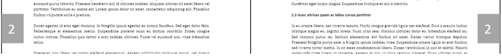
A practical example: Imagine that your second chapter is called “Interaction of the soil microbiome with biotic and abiotic factors of the ecosystem in Kenyan potato farming”. If you choose to display the chapter number on the left-hand page header and the chapter title on the right-hand page header, it could look something like this:

So far, so good? Well, not really. Even if you can’t make out the words, you will immediately see that the chapter title is too long for a single line. You should never have more than one line of text in the header! Therefore, if you have very long chapter titles, you should come up with shorter ones for the headers. We could shorten the above example to: “Soil microbiome-ecosystem interactions in Kenyan potato farming”. Now the header looks like this:

As you can see, the title in the header is now shorter than the line the separates the header from the main area. This looks better than if the title were the same length as that line.
Sounds too complicated? Contact me for help with your PhD thesis layout
Guiding your reader with the header and footer of your PhD thesis
Now, to guide your reader even more thoroughly, you could also omit the chapter number in the header – in that case, I strongly recommend using a thumb index. Instead, you can print the (shortened) chaper title in the header of the left-hand page and the section title in the header on the right-hand page. If your first section is called “Composition of the soil microbiome”, your header would look like this:

However, this approach has some drawbacks. If you have a very short section somewhere, you may end up with two section titles on one double page. Then, you would have to omit one section title from the header. Also, having long lines of text in both headers can make it look overfull. In the end, though, this is a question of personal taste.
So much for the header – what about the footer of your PhD thesis?
When writing a PhD thesis in a European language – like English – you will write it from left to right, from top to bottom. We are so used to this that a reader’s eye will always snap to the upper left corner first when they turn the page. Hence, the header is the best place to put the most useful information.
The footer, however, contains a piece of mandatory information: the page numbers. Without them, the reader will not be able to navigate your PhD thesis at all. I strongly recommend to put the page number on the lower right corner. In theory, you could put it in the middle of the page, But then, your reader will have to open the book wider when searching for a page. This makes leafing through the book harder. Hence, I don’t recommend it.
I also don’t recommend putting any other information in the footer than the page number. The reader subconsiously expects the chapter title, etc. in the header, not in the footer. Plus, putting text in the footer makes the page look bottom-heavy, which is not pleasing to the eye.
How should you style the header and footer of your PhD thesis?
In the above examples, there is a line below the header text. This line serves to tell the reader that the text in the header is not part of the main text. It does so subconsciously by guiding the reader’s eye.
Don’t like the line? There are ways to make it less conspicuous or even omit it completely. You can, for example make it very thin. Or, instead of black, you can make it a shade of gray. But whatever you do – always make the line exactly as wide as the main text. Everything else makes the page look cluttered!
Another good styling rule is to set the headers and footers of your PhD thesis in the same font, same font size and same font style. Ideally, you will pick a different font or at least a different font size than you use for the main text. That way, your reader can easily differentiate between the main text and the header and footer. If you choose not to have a line below the header, having a different font and/or a different font size from the main text is mandatory.
A good stylistic practice is to have the header and footer in the same font as your section, subsection, etc. headings and at a smaller size than the main text.
For numerous examples of header and footer layout, check out the Example PhD thesis!
A thumb index makes your thesis utterly browsable
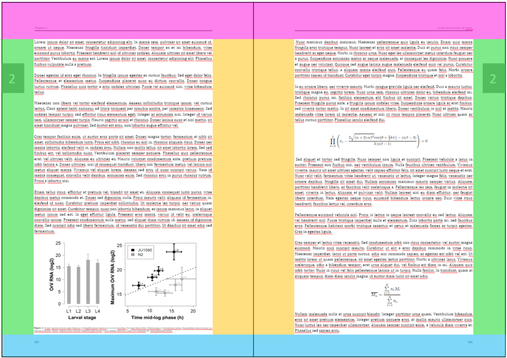
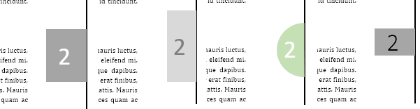
A thumb index is a colored field at the edge of every page. This field contains the chapter number and moves further down the page with every chapter. That way, your reader only needs to open your thesis a fraction (with their thumb) to find the chapter they are looking for.
There are two things that you must always do when styling a thumb index. You must give it a color. And it has to reach the edge of the page. Otherwise, your reader will not be able to see it when the book is closed – and that is the whole point of a thumb index!
However, the thumb index reaching the edge of the page is not as trivial as it sounds! After all, printing companies have an error margin of 3 mm when cutting a page. So, if you put the thumb index exactly until the edge of the page and the printing company cuts slightly outisde of that edge, you have a problem – the thumb index won’t reach the page edge anymore! Therefore, always let the colored box of the thumb index run over the edge of the page by at least 3 mm. This is called bleed and is covered in more detail here.
The printing company might also cut too far inside the page. Therefore, make sure that the chapter number at the page edge is at least 3 mm away from the edge. This is called crop and is also covered here.
Which color should the thumb index be?
As to the color of the thumb index, I recommend a shade of gray. Whether you make it light gray or dark gray is up to you. You can keep this in mind, though: If your pages are very dark in general because you either have long stretches of dense text or a lot of dark figures, you can make the thumb index dark gray. If your pages are light because you have short stretches of text with light figures or mathematic equations in between, you should make the thumb index llight gray so it doesn’t call undue attention to itself.
If you have the funds, you can even make the thumb index a color that fits the general color theme of your thesis. However, this will make every page a color page and your thesis quite expensive! It might also jump out of the page and pull attention away from the text if the color is too intense. By the way, to learn all about color space and whether you should use RGB or CMYK for your thesis, check out this article.
The chapter number in the thumb index should usually be white or a different, clearly discernible shade of gray. If you want the chapter number to be black, choose a thin font so the number isn’t too dominant.
Here a few examples of thumb indices:
If you want to see some more thumb indices in action, check out the Example PhD thesis.