There are thousands of fonts out there – which one should you choose for a great-looking PhD thesis? I will explain the differences between serif and sans-serif fonts, what ligatures are and why you shouldn’t use that fun free font you found on the internet.
Great fonts for a PhD thesis: Serif vs. sans-serif
As I explained in my Ultimate Guide to preparing a PhD thesis for printing, there are two basic kinds of fonts: Serif fonts and sans-serif fonts. Serif fonts have small lines – serifs – at the ends of all lines. Sans-serif fonts don’t have those lines. Compare these two, Palatino Linotype and Arial:
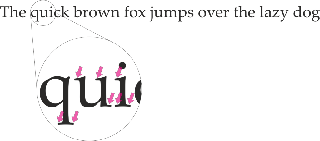
Serifs guide the reader’s eyes, making sure that they stay in the same line while reading a printed text. In turn, your reader’s brain won’t get tired so quickly and they can read for longer.
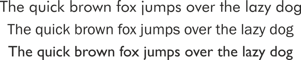
But there is another feature that many serif fonts have. Look at these three (which are all great fonts to use in your PhD thesis, btw):
If you look closely, you will see that serif fonts often have different stroke thicknesses within every letter. This is called “weight contrast”. A subtle weight contrast further improves legibility of a printed text. Hence, I recommend you use a serif font with a bit of a weight contrast for your main text.
Which serif font should you choose?
But whatever you do, this one thing is extremely important: Choose a font that offers all styles: regular, italics, bold, and bold italics. Since these four styles all need to be designed separately, many fonts don’t offer all of them. Especially bold italics is absent in most free internet fonts and even from many fonts that come with your operating system or word processor.
Also: In your bibliography and in-text citations (if you go with an author-year citation style) you will have to display author’s names from all over the world. Many of them will contain special letters. For example German umlauts (ä, ö, ü), accented letters used in lots of of languages, i.e. French or Spanish (à, é, ñ, etc.), and dozens of other special letters from all kinds of languages (ç, ı, ł, ø, etc.). Be aware that only a very limited number of fonts offer all of these!
If you have mathematical equations in your thesis that require more than +, – and =, your font choices are limited even further. After all, the vast majority of fonts do not offer special operators.
As you can see, these criteria severely limit your choice of font for the main text. Needless to say, they rule out free fonts you can download from dafont.com or 1001fonts.com. That is why I urge you to go with a classic font. To make things easier for you, here is a table with serif fonts that offer all the characters you could dream of:
Failsafe serif fonts for your PhD thesis
| font name | width | year of origin |
| Book Antiqua | medium | 1991 |
| Bookman Old Style | wide | 1858 |
| Cambria | medium | 2004 |
| Century | wide | 1894 |
| Constantia | medium | 2006 |
| Garamond | wide | 1989 |
| Gentium Book Basic | medium | 2005 |
| Georgia | medium | 1993 |
| Palatino Linotype | wide | 1950 |
| Sitka Text | wide | 2013 |
| Times New Roman | narrow | 1932 |
These fonts are heavily based on fonts that have been in use since the invention of the mechanical printing press in the 15th century. Hence, these types of fonts have been tried and tested for more than 500 years. Hard to argue with that!
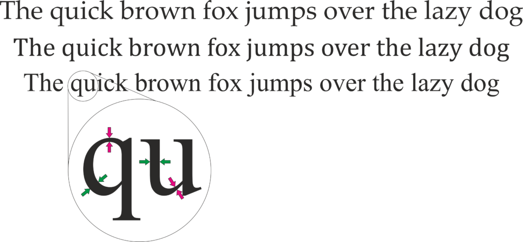
But which of these fonts is The BestTM for a PhD thesis? That depends on how much text you have in your thesis vs. how many figures, tables, equations, etc. As I have noted in the table, fonts have different widths. Look at this image showing the same text in Times New Roman (TNR), Cambria, and Sitka Text; all at the same size:
Hence, setting entire pages of text in TNR will make the page look quite dense and dark. So, a thesis with a lot of text and few figures is best set in a wider font like Sitka Text. On the other hand, if you have a lot of figures, tables, etc., TNR is a good choice because it keeps paragraphs of text compact and therefore the page from looking too empty. Medium-width fonts like Cambria are a good compromise between the two.
To see some of these fonts in action, check out this example PhD thesis where I show all sorts of font combinations and page layouts.
When to use a sans-serif font in your PhD thesis
This covers serif fonts. But which sans-serif fonts are great for your PhD thesis? And when do you use them?
As mentioned above, serif fonts are good for the main text of your thesis. But titles and headings are a different story. There, a sans-serif font will look very nice. Plus, using a different font in your headings than in the main text will help the reader recognize when a new section begins.
Here are some examples for good sans-serif fonts:
Each of these fonts – Futura, Franklin Gothic Book, and Gill Sans – are wonderful for headings in a PhD thesis. Why? Because they are easily readable, well-balanced and don’t call undue attention to themselves. Also, they have many options: regular, light, medium, bold, extra bold, including italics for all of them. And most operating systems or word processors have them pre-installed.
The criteria for heading fonts are not nearly as strict as those for main text fonts. If you have Latin species names in your headings, make sure the font offers (bold) italics. If you need to display Greek letters in your headings, make sure the font offers those. Done.
However, there are some criteria for headings. Just for fun, let’s have a look at some sans-serif fonts that would be a bad choice for a thesis:

I’d like to explicitly state that these are wonderful, well-designed fonts – you just shouldn’t use them in a scientific document. Heattenschweiler is too narrow, Broadway has too much weight contrast and Aspergit Light is too thin. All of these things impair readability and might make your opponents squint at your headings. Of course, you will want to do everything in your power to make the experience of reading your thesis as pleasant a possible for your opponents!
How are these fonts great for my PhD thesis? They are boring!
Why yes, they are, thanks for noticing!
Seriously though, the fonts not being interesting is the point. Your PhD thesis is a scientific document showing your expertise in your field and your ability to do independent research. The content of your thesis, the science, should be the sole focus. A PhD thesis is not the place to show off your quirky personality by way of an illegible font.
However, you can infuse your personality into your thesis cover and chapter start pages. There, you can use a fun font, since you probably don’t have to display any special characters.
Choosing the right font is too much pressure? Contact me for help with your layout!
Don’t use fonts made for non-Latin alphabets (Cyrillic, Hanzi, etc.)
Every computer nowadays comes pre-installed with a number of fonts made for displaying languages that don’t use the Latin alphabet (Latin alphabet = The alphabet in which this very article is displayed). Prominent examples for languages that don’t use the Latin alphabet are Asian languages such as Chinese, Japanese, Korean, Thai, etc. Other examples include the Arabic, Brahmic, and Cyrillic script. But there are many more fonts for a myriad of non-Latin alphabets. These fonts were optimized to make the characters of their languages easily readable.
However (and this is why I’ve written this entire section) they usually also contain Latin characters to be able to display the occasional foreign word.
Hence, you might want to honour your roots by using a font in your thesis that was made for your native language, by someone from your home country. It is tempting, because all the Latin characters are there, right? I completely understand this wish, but I strongly advise against it since there are some serious drawbacks.
Don’t get me wrong, I’m not throwing shade on these fonts, they are fantastic at what they were made for. Displaying long stretches of text in the Latin alphabet, however, is not one of those things. Let me explain why.
They don’t offer all necessary characters
Firstly, fonts made to display languages with a non-Latin alphabet contain the bare minimum of Latin characters. That is, the basic letters and the most important punctuation marks. Hence, they don’t have all those math operators and special characters I talked about in the section about serif fonts.
Also, the Latin characters in these fonts are usually sans-serif, so less suitable for long text.
But let’s say the non-Latin alphabet font you chose does offer all special characters and has serifs. Unfortunately, they are still not suitable to use in your PhD thesis, for the following reasons:
They are often too small or large for use with greek letters
Do you mention β-Mercaptoethanol or α-Histidin antibodies in your Materials and Methods? Or any other Greek letter? Since Latin characters are scaled differently in fonts made for non-Latin alphabets, Greek letters will not be the same size as the rest of the text anymore. For example, look at this text, where I rendered everything (I swear!) in the specified font size:
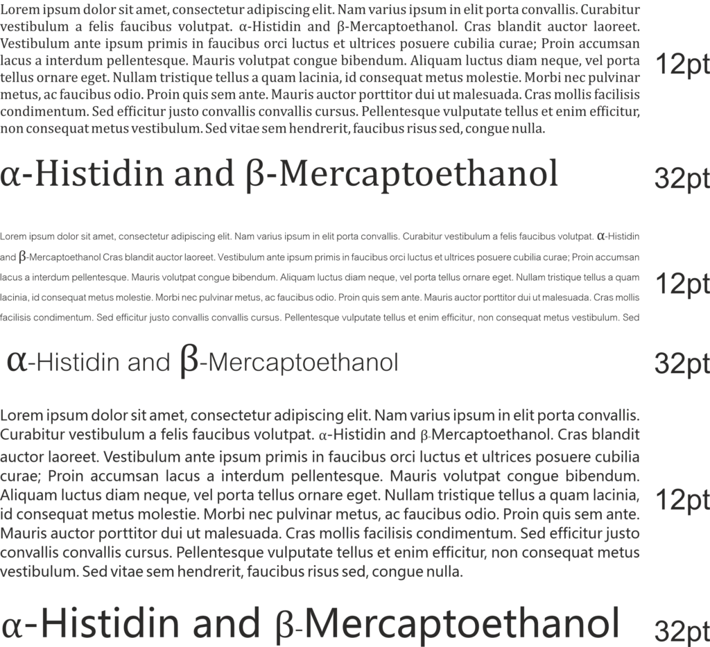
In the first panel (Cambria), the Greek letters are the same size and weight as the main text. As I have said, Cambria is one of the fonts explicitly recommended for your thesis. If you look closely at the enlarged line on the bottom of the panel, you can see that the alpha is the same height as the lower-case letters, whereas the beta is the same height as the upper-case letters. It looks neat and tidy.
However, by using a non-Latin font for your PhD thesis, you are asking for trouble.
In the second panel, I show Cordia New, a font for Thai script. At 12 pt, it is way smaller than the Latin font. The Greek letters – which are also at 12 pt! – stand out awkwardly. Also, Cordia New produces a line distance that is larger than it should be when using it for a text in the Latin alphabet.
In the last panel I show Microsoft YaHei for displaying Hanzi characters. Here, the Latin characters are larger. This leads to the Greek letters being too small. And, as you can see in the second and third lines of the paragraph of text, the line distance is quite narrow. However, the Greek letter β requires a regular line distance. So, it pushes the following line down, making the paragraph look uneven.
They don’t offer ligatures
Now, what on earth are ligatures? I could dive into the history of book printing here but I’ll spare you those details. In essence, Ligatures are two or more letters that are printed as one single glyph. Let me show you:
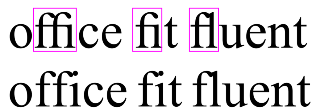
In the top line, you can see that the characters inside the boxes “melt” into each other. This single shape made out of several letter is called a ligature. They are mostly common with the small letter f. If you take a magnifying glass and look at the pages of a novel, you will quickly find these same ligatures. E-readers also display ligatures. Heck, even WhatsApp does it!
Ligatures also make the text easier to read. However, in order to display them, a font actually has to have the glyphs for the ligatures. And many fonts don’t. In order to find out whether a font you chose offers them, go to the character map of that font. (In Windows 10, simply click the windows logo in the corner of your screen and start typing the word “character”.) Pick a font in the drop-down menu. Now, search for the word “ligature” in the character map. If the map is empty after this, the font has no ligature glyphs.
All that being said, ligatures are not super important. I just wanted to mention them.
You can still use fonts made for non-Latin alphabets
If you want to honour your roots by way of a font, you can still do this. For example in your thesis title and/or for the chapter start pages.
In a word: Don’t go crazy with those fonts! Let your science do the talking. If you want to see what your thesis could look like with some of the fonts I recommended, check out the example PhD thesis.
Do you want to see a font combination that’s not in the example thesis? Contact me and I’ll set a few pages in your desired font, free of charge!