When you prepare figures for a paper or grant proposal, you may have stumbled across the terms RGB and CMYK. They are the acronyms for the most common colour spaces. If you know how to use colour spaces correctly, your printed grant proposal or paper will look neat and professional. I will also explain to you how a third colour space called grayscale can save you money if you print something yourself.
What is colour space?
I briefly explained RGB and CMYK in the Guide to making figures for a paper or grant proposal. But here, I’ll give you all the details! First of all, what does “colour space” even mean? Well, a colour space describes the type of information used to produce a colour. For instance, if you describe the colour of the grass in front of your house, you might say “light green”. This contains two pieces of information – the hue of the colour (green) and its saturation (light).
Let’s use this principle on the common colour spaces RGB and CMYK: Instead of using hue and saturation as information, they simply use numerical values of different colours. With those values, they tell you how much of a certain colour is mixed with what amount of another colour to produce the colour you see. Put in terms that you learned at school, one part blue and one part yellow would make green. Two parts blue and one part yellow would make blue-green.
RGB produces colours by mixing three base colours: Red, Green, and Blue. CMYK mixes four colours: Cyan, Magenta, Yellow and Black. Let’s have a look at how RGB and CMYK mix their colours, exactly.
Figures in a paper: RGB is for screens, CMYK is for printing
Depending on how old you are, you may have seen a cathode ray tube (CRT) TV or computer monitor. If you ever got very close to it (even though your parents told you not to), you may have seen one of these patterns:
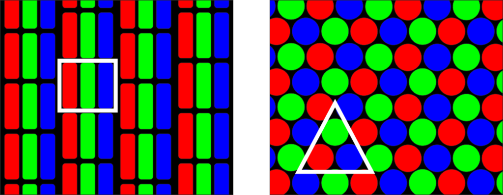
In essence, old-fashioned CRT monitors used three tiny “lights” in each pixel: a red one, a green one and a blue one. By changing how intense each of these lights shone, the pixel got a certain color. The RGB colour space works just like that.
Imagine you have three torches in the three colors of the RGB color space. You shine all three torches on the same spot on a perfectly black wall, like so:
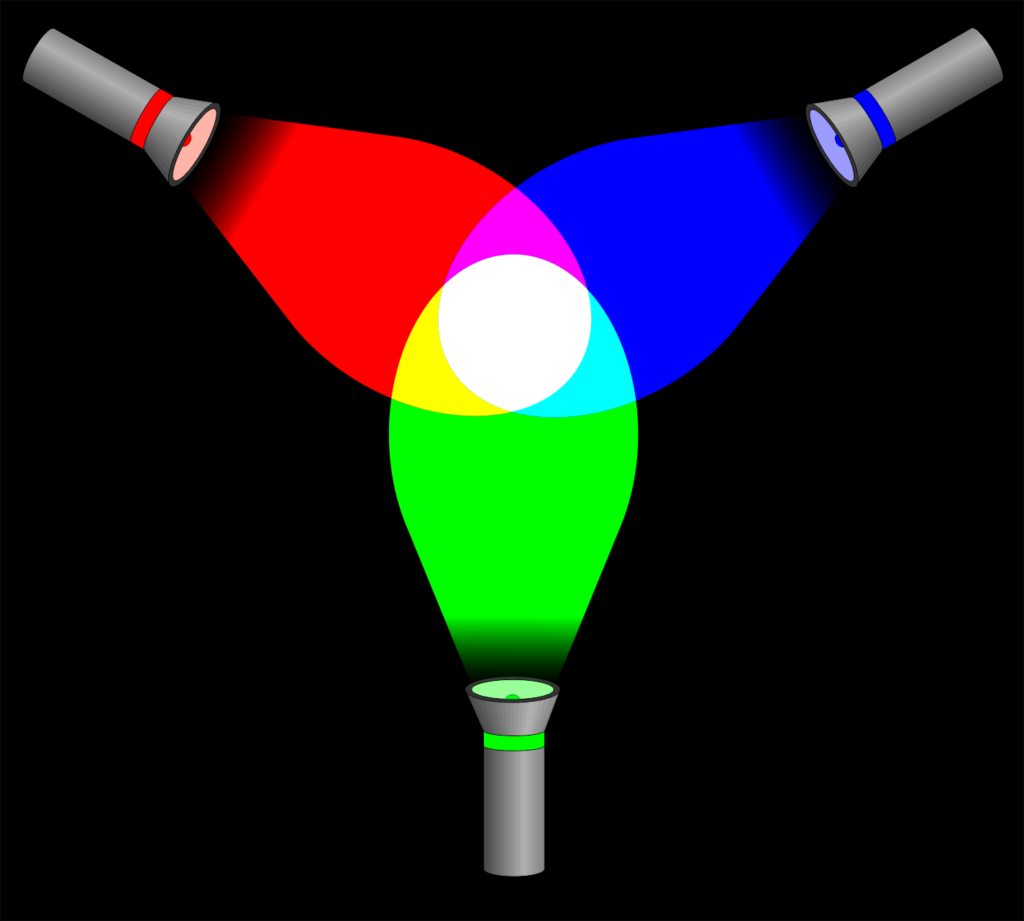
These three lights, at full intensity, combine into white light. Hence, if all three colour spots in a pixel on a CRT monitor shine at full intensity, the pixel looks white from a distance. By the way, each colour has 256 intensity steps: 0 is off, 255 is full intensity.
RGB paints with light
Now, what happens if we switch one torch off?
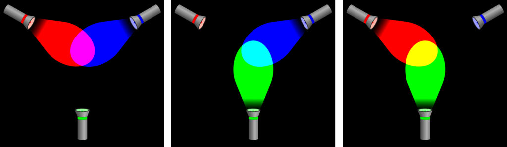
With one torch switched off, we get a combination of only two colours. The result is a colour other than white, obviously. And what happens when we randomly change the intensities of each torch?
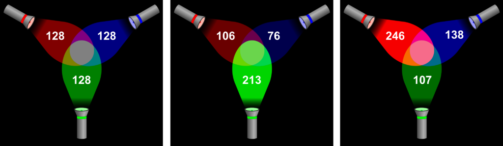
By now, I’m sure you got the idea: All kinds of intensity combinations make all the different colours in the RGB colour space. In the left panel of the previous image, you can see that if all colours are at the same intensity lower than 255, a shade of gray ensues. When all torches are off, meaning the value of all colours is 0, the resulting colour is black.
The RGB colour space “paints with light”. Meaning that, the more colour you add, the brighter the colour gets. Hence, RGB is referred to as an additive colour space – more colour adds to the brightness of the result. Since figures in a paper or grant proposal are printed at some point, you will have gathered that RGB is not the right colour space to use – CMYK is.
By the way, RGB images will usually have the file extension PNG.
RGB vs CMYK: The CMYK color model is for printing
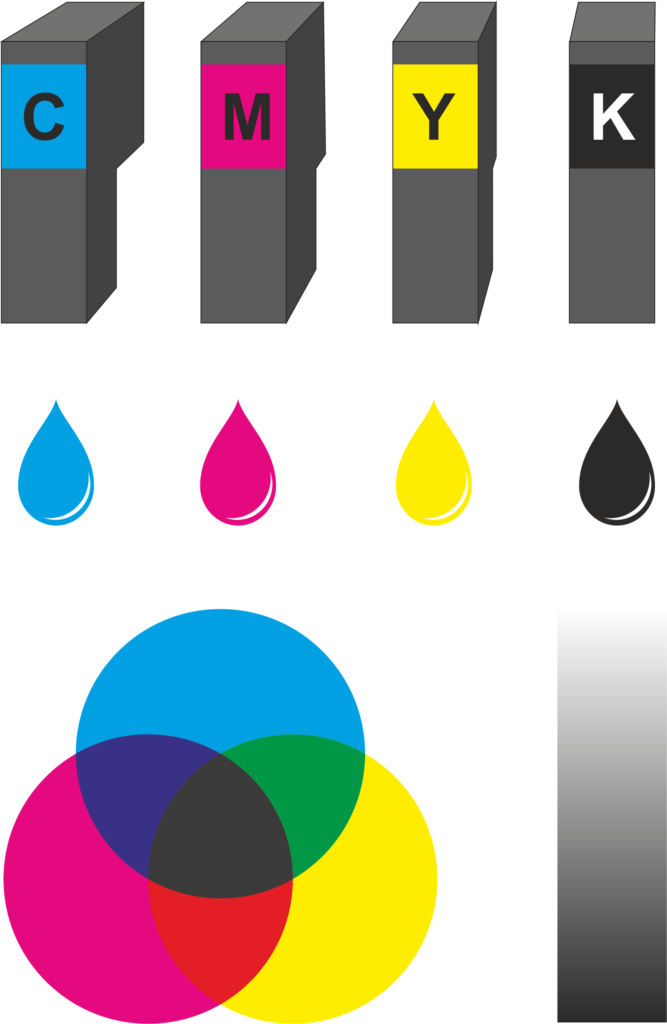
As mentioned above, CMYK stands for Cyan, Magenta, Yellow and Black. Do these four colours remind you of something? Maybe those obscenely expensive printer cartridges you have to keep buying for your inkjet? That’s right, all printers – from the one in your home office to a giant poster printer at a professional printing company – use the CMYK colour space.
Printers, of course, use actual, physical pigment to produce a colour. By mixing different amounts of each ink for a printed pixel, it produces the desired colour. In CMYK, the numerical values for each colour range from 0 (none) to 100 (full intensity).
But why are there four colours, not just three? Simple: When you take a look at the image on the left, you can see that the combination of Cyan, Magenta and Yellow does produce some kind of murky brownish-purple, definitely not true black. To get black and shades of gray, you need black ink.
In CMYK, the more colour you add, the darker the result gets – hence, CMYK is referred to as a subtractive colour space – more colour takes away brightness from the result.
Colour spaces giving you headaches? Contact me and I’ll make your figure for you!
Figures on screen vs. in a paper – CMYK cannot produce the colours that RGB can!
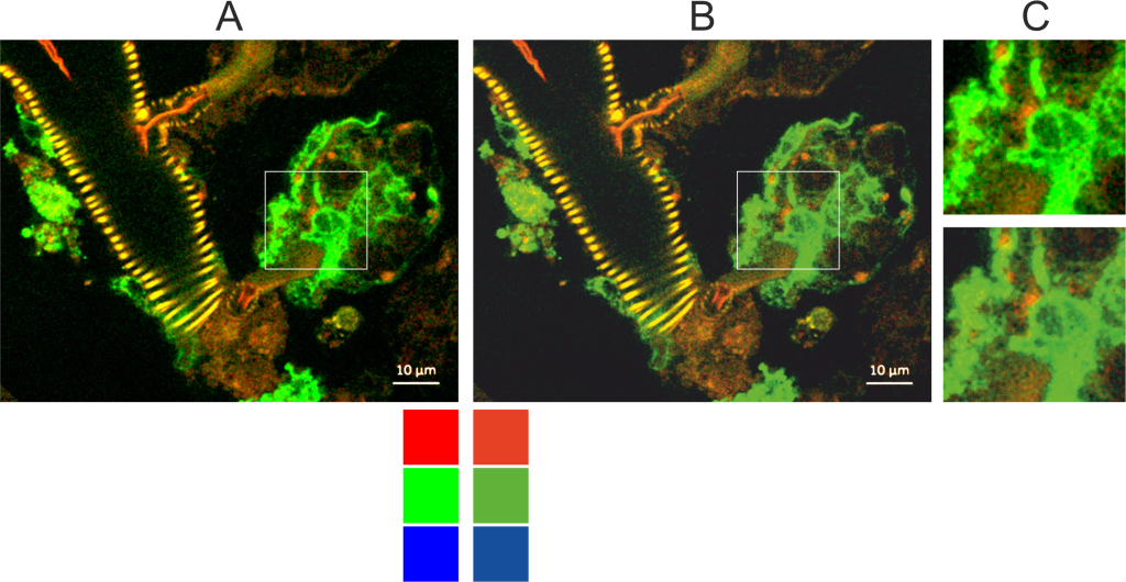
A major disappointment that you may face when printing a paper showing figures with fluorescence is that the colours will look different – this is directly related to our RGB vs. CMYK problem.
Imagine using your paintbox from school to paint fluorescent signals you see with a microscope. Imagine yourself trying to mix the bright green and magenta your cells are emitting using acrylics. It’s not possible. You simply cannot reproduce colours made with light using normal pigments. As a rule of thumb, you can remember that printed colours will look less bright than colours on a screen.
Thus, if you can, convert images with fluorescent signals from RGB to CMYK. That way, you can see beforehand what the figure will look like when printed in a paper. You can use your program of choice, i.e. Corel Photo-Paint, to tweak the brightness and contrast settings in such a way that most of the information in the image is preserved
You can even extract the red, green and blue channels (i.e. from Fiji ImageJ), import them to CMYK channels in a photo editing program and adjust the colours to something different to preserve as much image information as possible. Here is a paper about that approach.
Please note: CMYK images will usually have the file extension JPG. JPG does not support transparency! If you want a CMYK image with a transparent background, you will have to export to EPS or TIFF.
As a side note: Printed products that have screaming neon colours are printed with special phosphorescent pigments (ask printing companies for spot colours).
Got a Western blot figure in your paper? Use neither RGB nor CMYK!
There is a third colour space that is important when preparing a scientific document for printing: grayscale. And using this colour space can save you a lot of money! Look at these two pages:
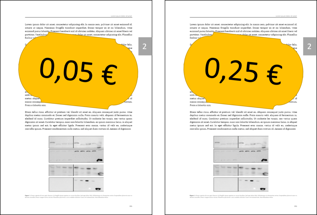
The pages look exactly the same, yet the left page will cost about five cents to print while the right page will cost about twenty-five cents. The reason for this is that the Western Blot on the right page has been exported from RGB to CMYK. Even expensive programs like Photoshop are not able to tell that this image is supposed to be all gray and black! What all colour space converters do is “look” at the colour on the screen and try to reproduce it as closely as possible using the colour space you tell it to use.
What you will end up with if you export a black-and-white RGB image to CMYK is this:
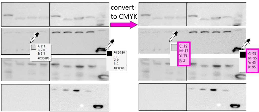
As you can see, the CMYK image, on the right, produces different shades of gray by any odd mix of the four colours. If you send a PDF to the printer that has an image like this in it, the printer will read this in as a colour page because it is, in fact, using cyan, magenta and yellow ink on this page. And you will pay accordingly!
Exporting to grayscale 8 bit makes printing cheaper
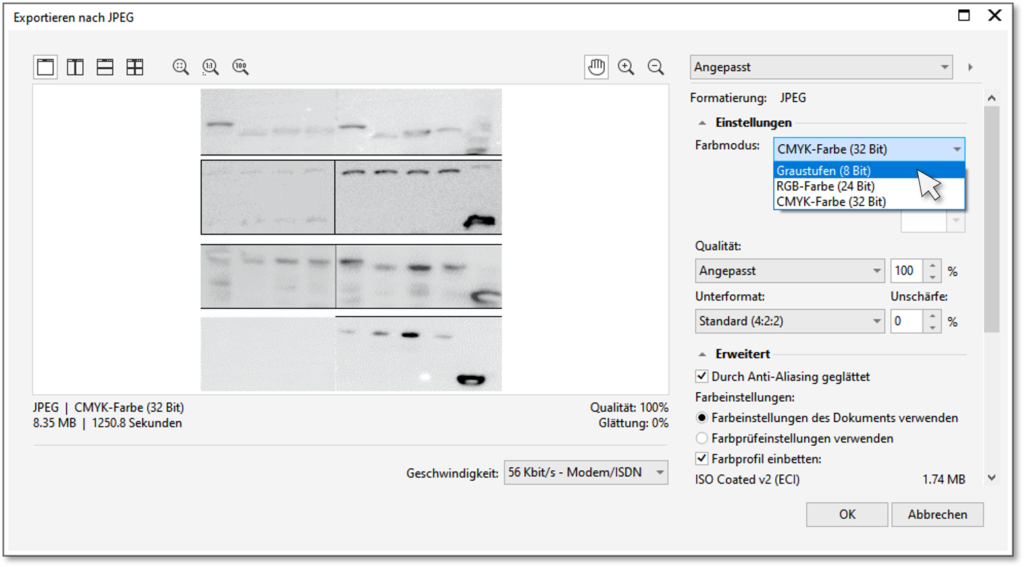
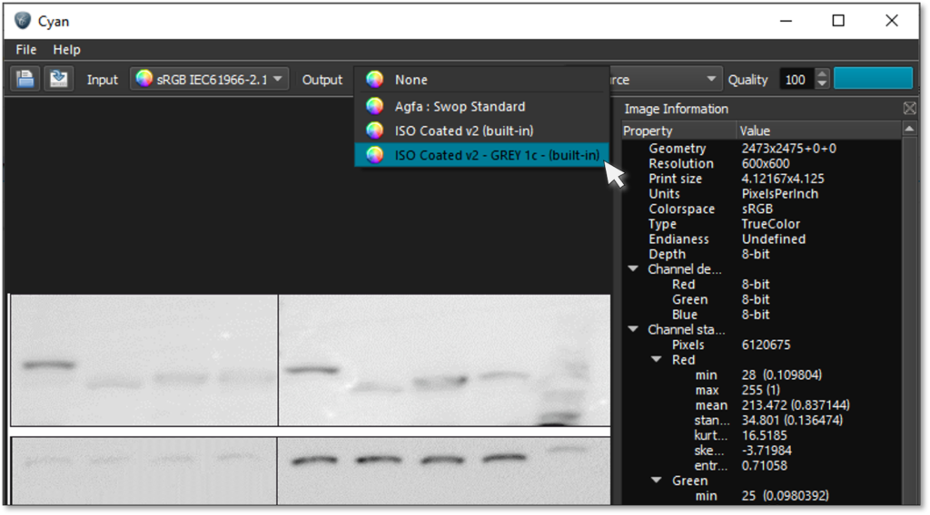
Instead of falling into this trap, export the image to grayscale. It will look exactly the same but be “coded” so that the printer only uses black ink to produce the shades of gray. Every digital photo manipulation or colour conversion program – whether you use free ones like the Cyan image converter, reasonably priced ones like Corel Photo-Paint or terribly expensive ones like Adobe Photoshop – offers an option to export to grayscale, often with the addition “8 bit”. This has the nice side effect that the image file will be much smaller. Here’s a screenshot of Corel Photo-Paint’s and Cyan’s grayscale export options (apologies for the German language version):
Some printing companies have picked up on this and have found a workaround: They will read in every single page as grayscale and you will have to tell them which pages have color on them. However, generally speaking, the color space in which you deliver your images is your responsibility.
Sounds like too much work? Contact me for help with your scientific illustrations and thesis design